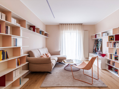
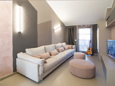
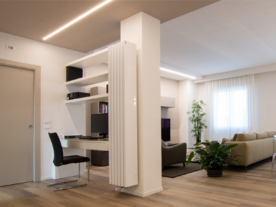
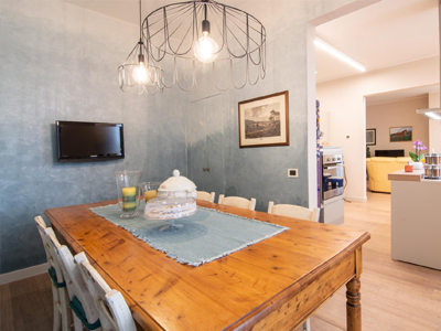
Casa Puer
Residential -San Giovanni Valdarno -August 2024Project Info
San Giovanni Valdarno -August 2024
Project year: 2021
Realization: 2022-2024
Sqm = 120 apartment + 1 terrace
Interior Design, Lighitng Design, Artistic Management: Rachele Biancalani Studio
Photo: Studio Daido
Customer Requests:
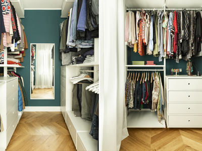
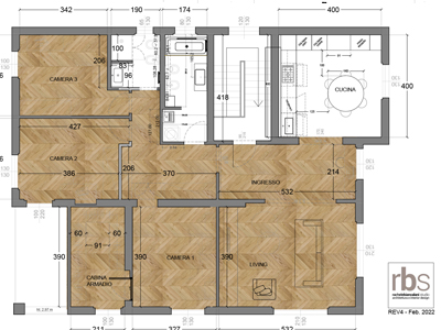
1-Divide the apartment in order to create 3 bedrooms, one of which with a walk-in closet, making the
most of the space available without overwhelming and at the same time having a large open space living
area
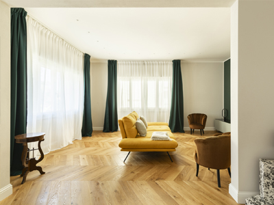
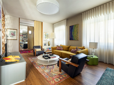
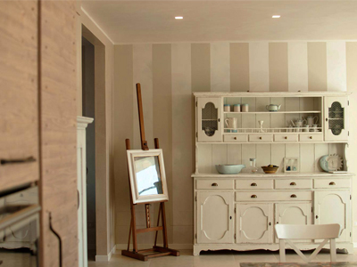
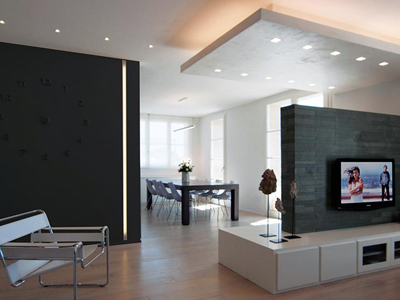
2-Choose floors, coverings, finishes and furnishings reconciling the very different tastes of the two
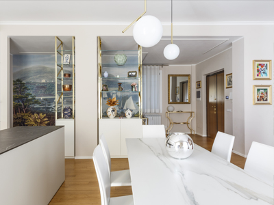
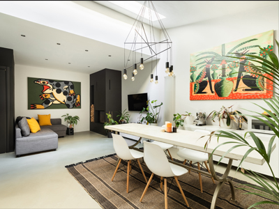
homeowners: for her a vintage, sophisticated and retro style while for him a contemporary and industrial
style
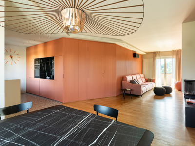
3-Plenty of storage space = cabinets, cabinets, cabinets
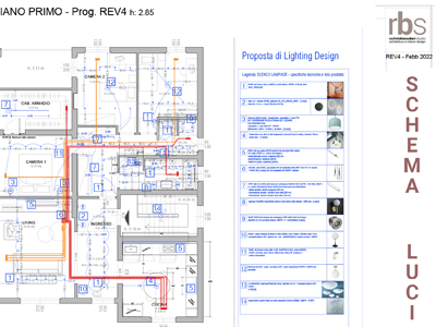
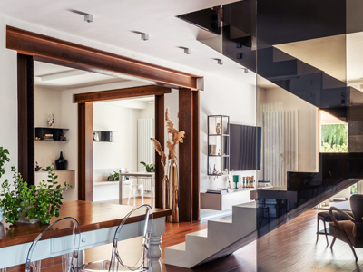
4-Special focus on lighting by mixing functional and furnishing lights
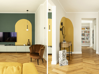
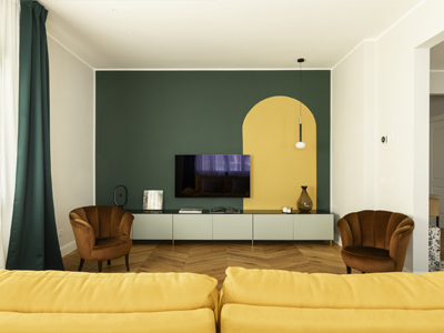
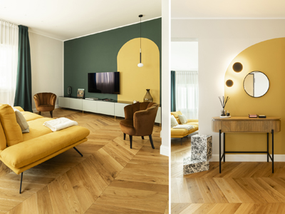
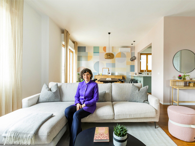
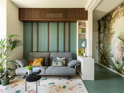
5-Particular attention to colours, textures and decorations, not banal, not loud
Project style: retro with vintage touches
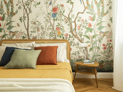
Colors used: green, petrol, mustard, wisteria, whale blue
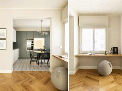
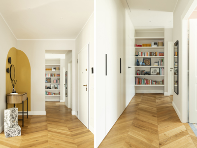
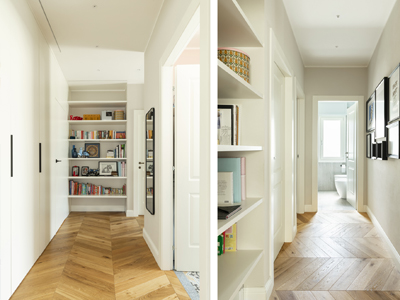
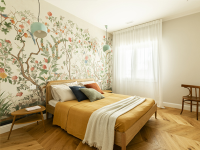
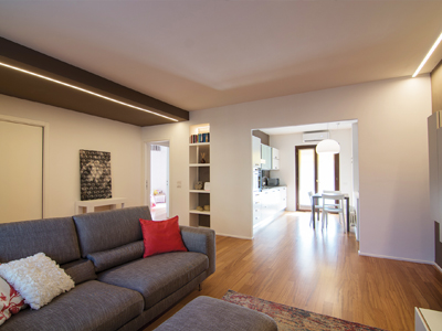
Materials used on the floor: natural oak parquet laid in a French herringbone pattern, porcelain
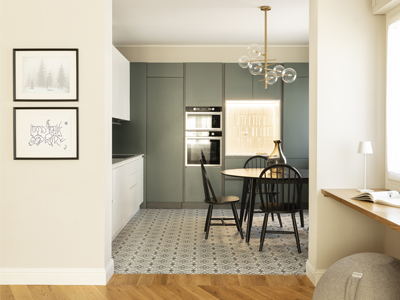
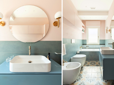
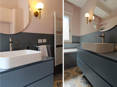
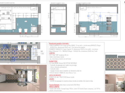
stoneware (cementine and terrazzo effect) in bathrooms and kitchens
Wall decorations/coverings: wallpapers, color blocks, stoneware
“Goodies” of the project:
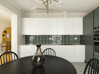
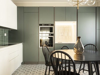
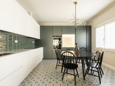
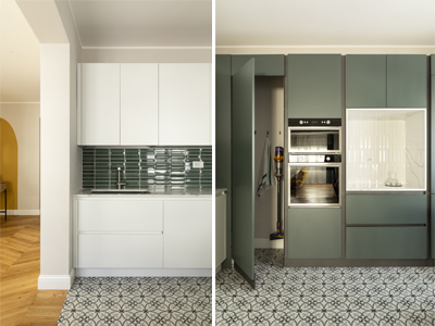
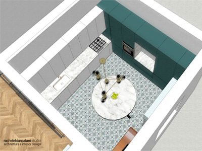
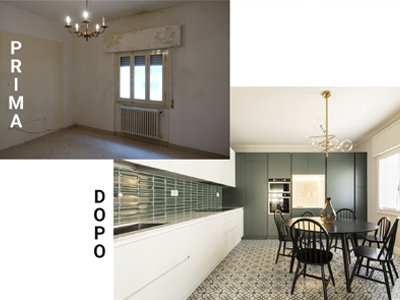
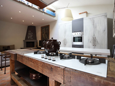
1-The walk-in pantry in the corner of the kitchen: lots of very comfortable space to store proceeds without
having a special room as a pantry
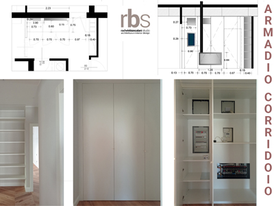
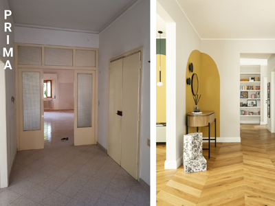
2-The equipped wardrobe in the corridor which hides meters, manifolds and... the door to the master
bedroom!
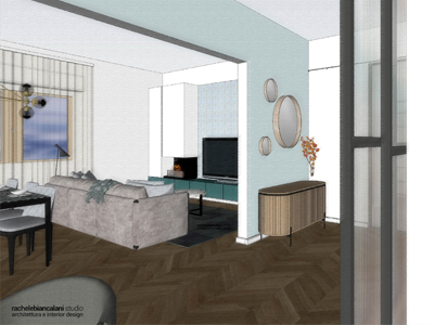
3-The use of color blocking that creates and defines volumes that come to life in a three-dimensional
way, making the walls vibrant
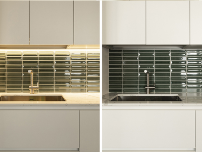
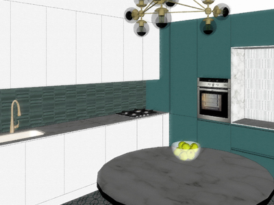
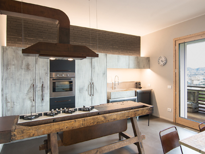
4-In the kitchen the play of full and empty spaces alternates between white and green, alternating 3D
furnishings and coverings, continuous surfaces and bright niches
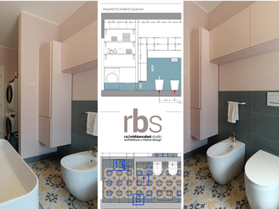
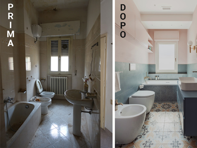
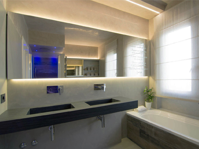
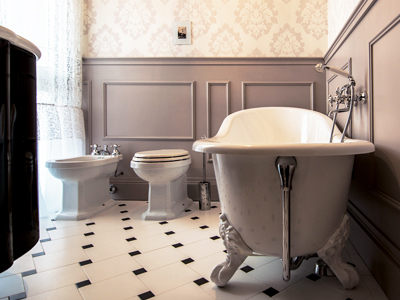
5-Under the window, near the bathtub, we wanted to create a long niche to comfortably place soaps,
candles, sponges and everything you need for a relaxing bath
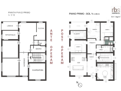
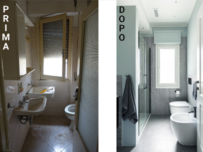
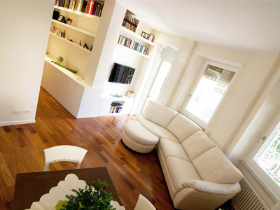
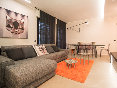
The apartment originally appeared before the renovation works with the living area reversed compared to the final solution. For reasons related to natural lighting and the presence of the main road, it was immediately decided to reverse the living and sleeping areas. Despite the challenge of having to reconcile the clients' tastes, a strong empathy was created right from the start between the architect and the clients which allowed them to get in tune and face the long journey through the "Bonus 110" together with serenity, arriving at the end of the journey in best of ways albeit with a certain slowness.
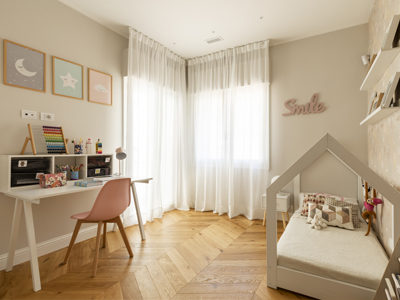
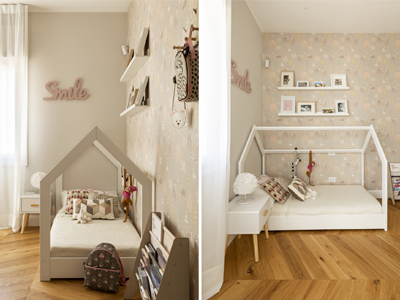
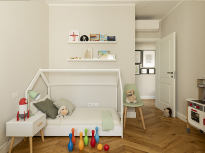
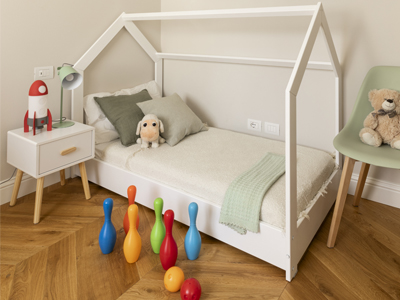
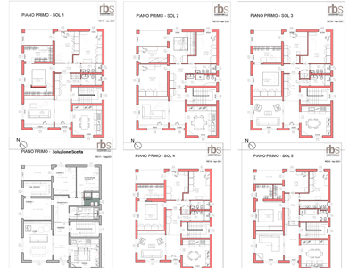
The project, which began in 2021, has undergone small adjustments and modifications over time, mostly relating to the color choices that have become more courageous over time: from a timid initial idea entirely in shades of green, gray and white (bathrooms excluded) we moved on to touches of complementary colors in all the rooms, with the exception of the two Montessori bedrooms which remained in neutral tones but no less refined.
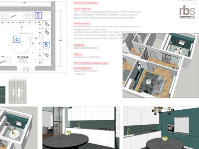
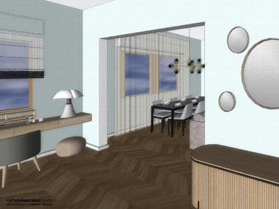
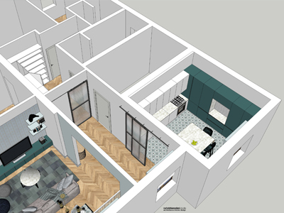
In the project, as can be seen from the 3D sketches, there are some industrial style iron and glass sliding
doors which will be built at a later time.
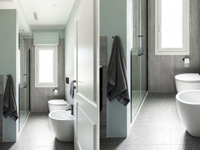
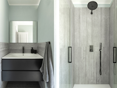
A niche has been inserted in the bathroom with tub which contains a sink, washing machine and dryer.


