Diagon Alley
Residential -Cavriglia -October 2024Project Info
Cavriglia -October 2024
Project year: 2021
Realization: 2022-2023
Sqm = 75 apartment + 45sqm ground floor + 150sqm terrace and garden
Interior Design, Lighitng Design, Artistic Management: Rachele Biancalani Studio
Photo: Studio Daido
Customer requests:
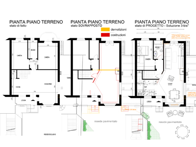
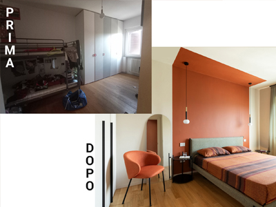
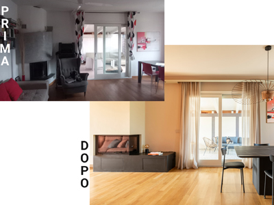
-Expand the living area by eliminating a bedroom
-Keep the existing parquet
-Create a lot of storage space
-Expand the existing kitchen without moving the drains
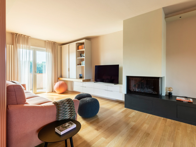
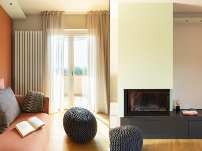
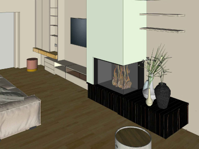
-Keep the fireplace in the same position
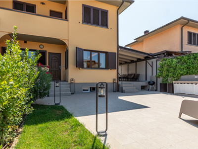
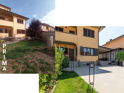
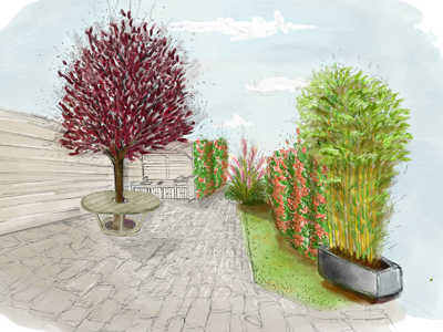
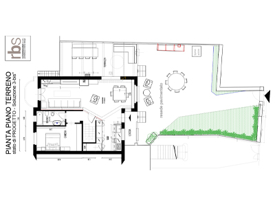
-Modify access to the garden on the road, reorganize the garden and outdoor kitchen area
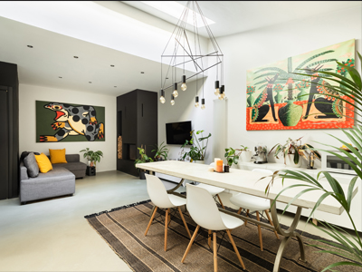
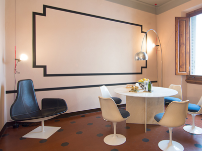
Project style: contemporary and colorful
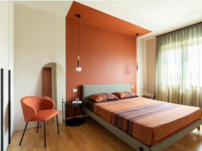
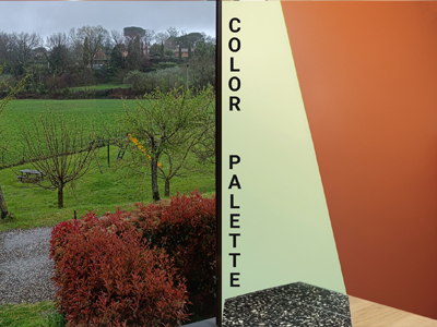
Colors used: terracotta, black, green, brick, beige
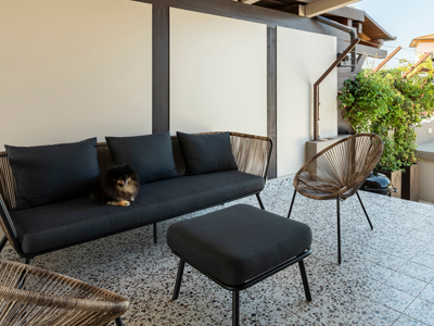
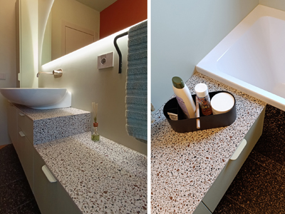
Materials used on the floor: natural oak parquet laid in a running pattern, porcelain stoneware (graniglia
effect) in the bathroom, kitchen and terraces. Outdoor garden flooring and kitchen idem
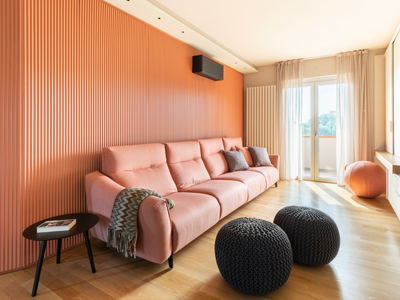
Wall decorations/coverings: microresin, color block, wood paneling
“Gems” of the project
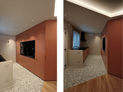
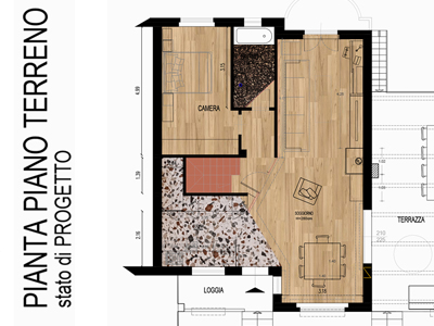
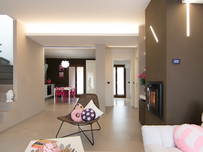
-The multiple diagonal cuts that design the volumes and rooms combining functionality and aesthetics
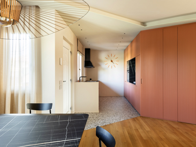
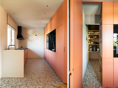
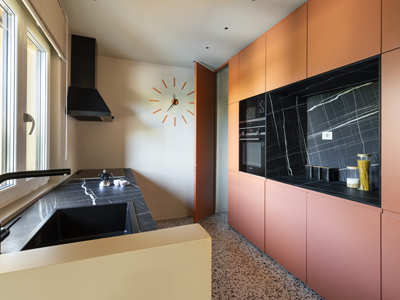
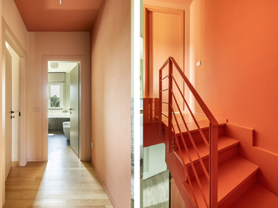
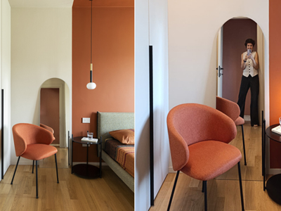
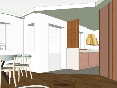
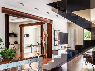
-The door to the sleeping area camouflaged in the terracotta-colored reeded paneling
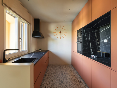
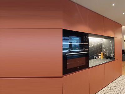
-The pantry hidden by the doors of the columns in the kitchen: the existing storage room has beenincorporated into the furnishings
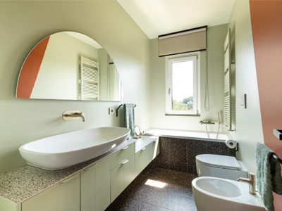
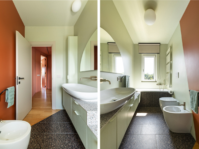
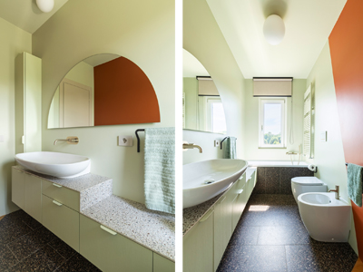
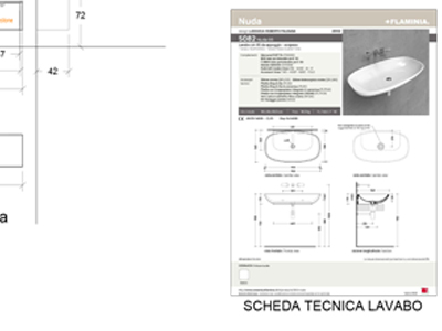
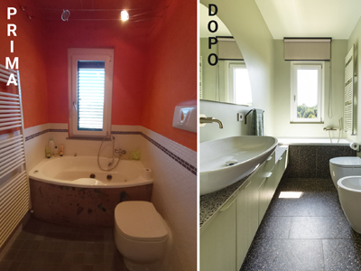
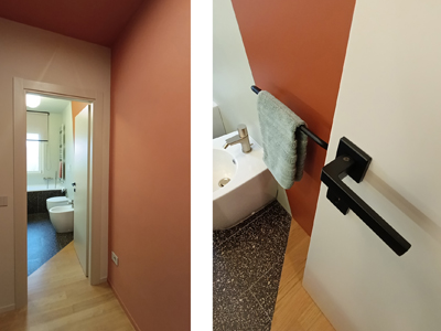
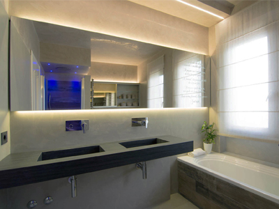
-The very long bathroom cabinet with a stoneware top of the same type as the stoneware used on the floor
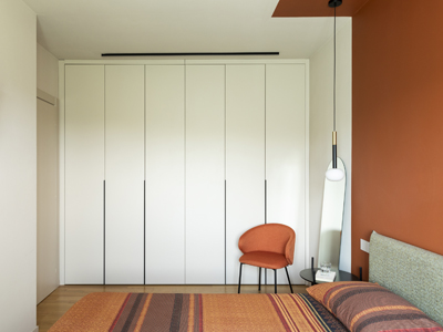
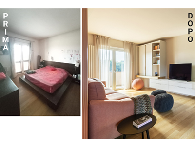
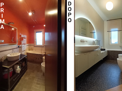
-The use of color block in the bathroom and bedroom
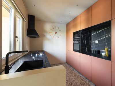
-The wall of the kitchen columns with the black negative volume “dug out” like a covered niche
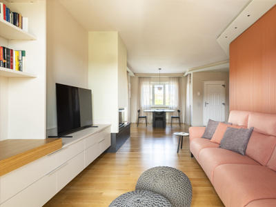
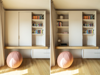
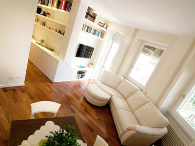
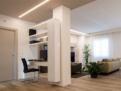
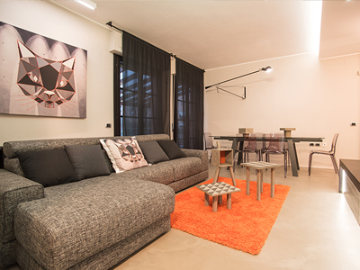
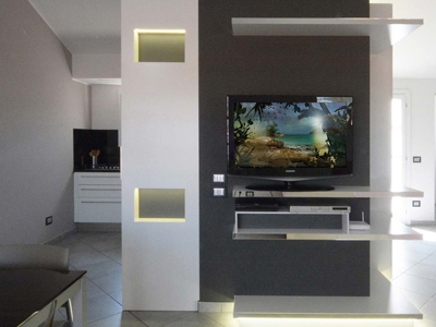
-The “home office” corner integrated and hidden in the TV wall unit
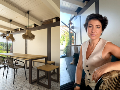
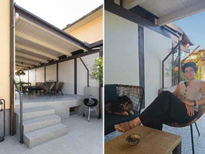
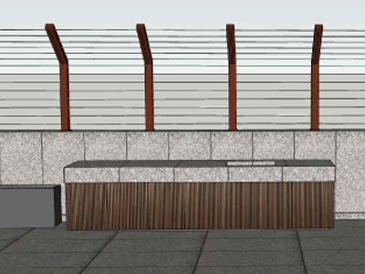
-The outdoor brick kitchen with a modern look thanks to the practical covering with maxi porcelain stoneware slabs
-The railing on the outdoor kitchen designed specifically to allow the jasmine to climb and the integrated LED strips that illuminate the working area
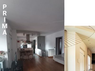
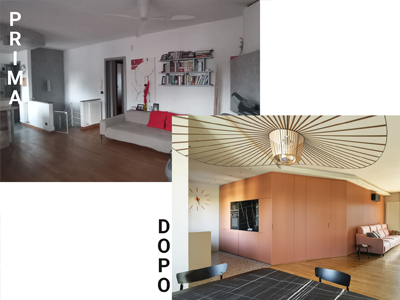
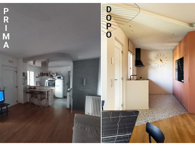
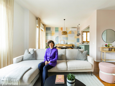
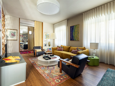
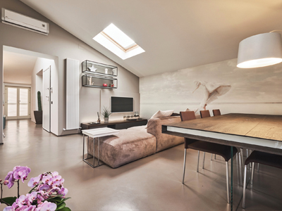
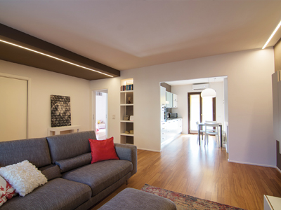
Giving up a bedroom is not for everyone, but my clients who had already previously renovated the basement, already had three bedrooms and for them they were more than enough, for this reason they asked me to eliminate the fourth bedroom in favor of a larger living area and study the way to expand the kitchen without moving it. By eliminating a single non-load-bearing partition wall we were able to take advantage of the light and the view of the surrounding countryside and woods, which immediately provided us with the perfect color palette: the warm colors of the Tuscan countryside and the woods in autumn!
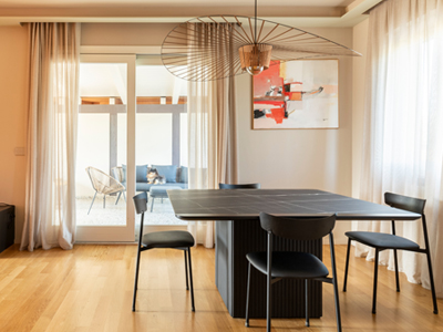
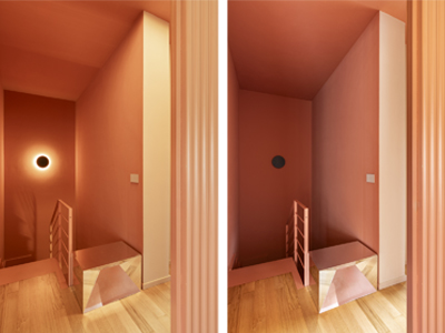
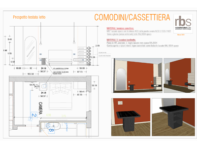
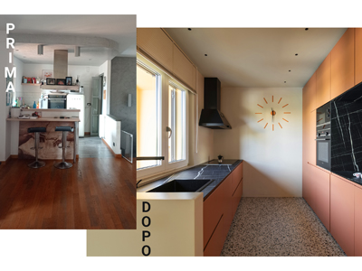
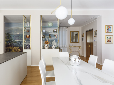
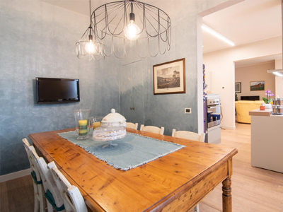
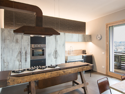
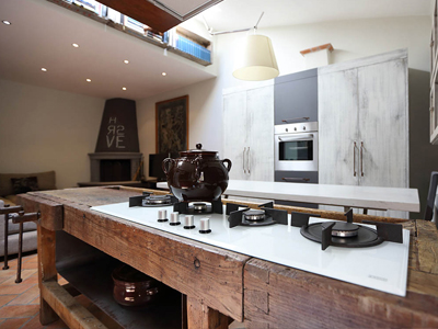
To allow the kitchen to be expanded without changing its position I proposed a solution that eliminated the peninsula and created a parallel kitchen with the working area on the window side (kitchen without wall units) and a column area with a central niche in front. The top is a black veined marble effect HPL with which we completely covered the niche between the columns and created the top of the square dining table entirely made to measure. The wall of the columns winds and becomes a reeded boiserie in which the door to the sleeping area and the hallway of the staircase leading to the basement are hidden; all strictly terracotta colored, including the staircase and handrail.
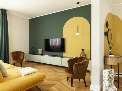
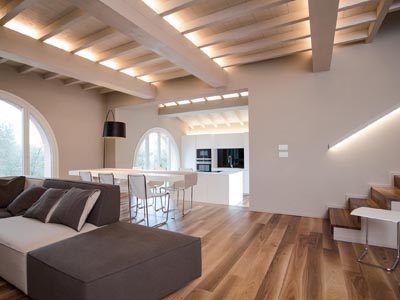
Practically all the furnishings (kitchen, indoor and outdoor table, TV wall, bedroom wardrobe, bathroom furniture) and the wood paneling (living boiserie) of the house are made to measure since my Client is one of the two owners of a carpentry shop (CB Interni) specialized in interior design. The project plan is characterized by some diagonal lines (hence the name of the work by assonance with "diagonals") that punctuate the spaces and design volumes that were not there before. The same diagonals were drawn on the floor to separate in a way that is not only decorative but above all functional: the areas with existing natural oak parquet (which was re-sanded and repainted with water) which is a type of wood that is rather sensitive to humidity, were replaced by stoneware in the kitchen, entrance and bathroom. The diagonal lines on the floor return on the walls and also on the ceiling (see plasterboard in the living room).
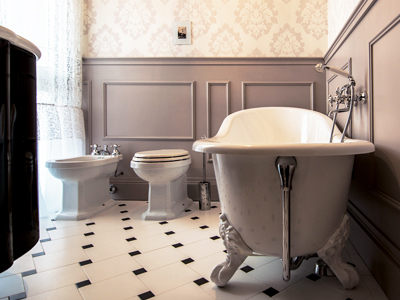
In the bathroom, the same positions of the sanitary fixtures that were there before the work were left, but the rest was completely renovated starting from the coverings. The same diagonal cut that was used in the kitchen was used to separate the stoneware from the wood, strictly WITHOUT PROFILES! The furnishings are practically all custom-made and designed by me, from the kitchen, to the TV cabinet, to the dining table with a top that is the same as the kitchen top.
PRODUCTS AND SUPPLIES:
-Table suspension: Petite Fruiture, Veritgo
-Appliances: Siemens
-Bedroom suspension: Miloox, Mose
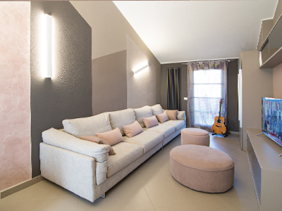
-Living sofa: Rosini
-Chairs: Connubia
-Mesh pouf: Sitap
-Desk lamp: Miloox
-Ergonomic ball seat: Vluv
-Recessed spotlights: I-LED, Quantum
-Garden lamps and master bedroom bedside tables: Trio lighting
-Outdoor table suspensions: Sklum
-Staircase wall lights: Ideal Lux, Round
-Bathroom wall lights: Ideal Lux, Mapa white
-Terrace furniture: Casa Shop
-Stoneware tiles: ABK and Atlas Concorde
-Bathroom covering: Kerakoll resin, Wallpaper
-SDR sanitary ware
-Nuda ceramic washbasin Flaminia
-Faucets: Oioli
-Wall Paints: Kerakoll Design
-Staircase Resin: Kerakoll Design
-Electrical Sockets: B-Ticino Living Now series
-Bathroom Accessories: Hiro Design


